Mixing art styles in one room is the design move people are most afraid to make and most often regret not making. The fear is that throwing a steampunk canvas next to a punk princess print will read as chaos. The reality is that one-style rooms feel like staged showrooms, and most homes that look effortlessly personal are quietly mixing three to five aesthetics on purpose.
The trick isn’t avoiding the mix. It’s mixing with intention. Below: how to combine art styles in one room without it looking like a thrift store accident.
Why mixed-style rooms work better than matchy ones
A room with one art style is a room that finished a thought too early. It tells a single sentence — “I like this aesthetic” — and then stops. A room with mixed styles tells a paragraph: who you are, where you’ve been, what you’ve collected, what you’re still figuring out. That’s the kind of room people want to spend time in.
Mixed rooms also age better. A pure dark academia room locks itself into one aesthetic moment. A room that mixes a dark academia print with a colorful nebula canvas and a steampunk owl gives you flex room — when the dark academia obsession peaks and recedes (it will), the room doesn’t have to be redone.
The 70/20/10 rule for mixing art styles
Borrowed from interior design and adapted for wall art: 70% of your art should share a dominant aesthetic. This is your room’s accent — moody, colorful, minimalist, whatever you’ve committed to. 20% complements but doesn’t match — different style, but compatible mood or color palette. 10% is the wildcard — the piece that breaks the pattern and makes the room interesting.
Concrete example: in a living room with three pieces of dark academia wall art (the 70%), add one steampunk canvas (the 20% — different style, compatible Victorian-gothic register), and one colorful nebula print (the 10% — the wildcard, jolts the room awake). The room reads as moody-with-personality instead of moody-as-monoculture.
Three mixing tactics that always work
1. Match the color palette across styles
The fastest way to make different styles cohere is shared color. A punk princess print, a steampunk canvas, and a pop art animal piece can all live together if they share two or three accent colors — say, brass tones, deep red, and black. The styles are different but the eye reads them as belonging to the same family. Pick the dominant accent of your favorite piece and choose your other art to echo it.
2. Match the framing and finish
Even wildly different styles look intentional when the framing is consistent. All canvas, no canvas; all matte paper in matching frames; all ready-to-hang gallery wraps. The frame becomes the unifying language. Mixed framing styles in a single room reads as accidental; matched framing reads as curated. This is why galleries frame everything the same way regardless of what’s inside.
3. Match the scale, not the size
Different art sizes are fine — different visual weight is what kills mixed rooms. A massive bright canvas next to three tiny dark prints reads as imbalanced. A medium-large piece (24×36 or so) next to two medium pieces (18×24) of equal visual presence reads as a curated wall. See the wall art size guide for hanging proportions, but the underlying rule is: the mixed pieces should pull roughly equal weight in the room.
What NOT to mix
A few combinations that consistently don’t work: aggressively bright pop art next to muted moody dark academia (color volumes fight). Multiple “wildcard” 10% pieces in the same room (everything becomes the wildcard, nothing anchors). Mixed motifs at the same size — three pieces all 24×36 in three different styles reads as can’t-decide rather than curated. Pick one to be the star.
If you find yourself with a room that’s not landing, the fix is almost always: pull one piece, not add another.
Frequently Asked Questions
Can I mix steampunk with cosmic / space art?
Yes — they share a sense of speculative imagination and tend to overlap on color (brass + deep blues, copper + galaxy purples). A steampunk owl next to a colorful nebula canvas works especially well in a den or office where the room’s already leaning thoughtful-weird.
How many styles is too many in one room?
More than four distinct styles in a single small-to-medium room starts to read as random. In a larger open-concept space, you can push to five or six, but you need to break them up with sight lines and zones — different styles in different defined areas. As a quick test: if you can’t describe the room in one phrase, you have too many styles.
Where do I start if I’m starting from scratch?
Pick one piece you love unreasonably. That becomes the room’s anchor. Build the 70% around its color palette and mood, then add 20% complement, then a single 10% wildcard. Don’t reverse the order — starting with a “system” instead of a piece you actually love produces rooms that look fine but never feel like yours.
Browse to mix
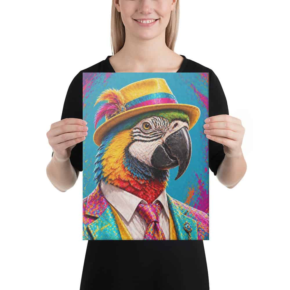
The Art That Bites collections are designed to mix well with each other — shared brand voice, compatible color palettes, consistent print quality. Browse: Dark Academia, Steampunk, Colorful Nebulas, Punk Princesses, Pop Art Animals, City Balloons. Pick your 70% first, then the rest is just curation. Get Smitten.